Wednesday, March 24, 2010

Chardonnay/Beer/Champagne

This posting is mostly for those people on FB that were asking how this project was proceeding.
Facebook was not playing nicely with me when it came to uploading images so I have chosen to present them in this format which seems to always work.

Encaustics are intriguing to me. I used to do off hand blown glass and just love messing with hot stuff. So the idea of making a mark and then floating that mark around inside molten translucent strata gets a gold star on the refrigerator in my book. I am a rank beginner in this art form and I make no inference here that I know what I am doing. But my loving the challenge so far. So here goes...

In this first image the cradle (24 X 18) is made of birch door skin and some old growth fir for stretchers in the back. The board has been heated and then primed with beeswax and then cover with a white wax medium to give me a clean smooth surface to start. I have then inscribed the surface with a stylus to cut in the bottle silhouettes. I then used an oil paint stick to force a pigment into the recessed incised lines. This is then heated with a heat gun to trap the pigment in the wax strata.

The next image shows the colors that have been added bit by bit and layer by layer. There is a fusing process that follows each application of wax. In essences you heat each layer and addition of wax to melt it into the surface below it. I have chosen to get everything a little extra hot which causes a “water color” effect. Although I'm sure a water colorist might take offense with that comparison.

In this last image the fused glass panels were made of old broken bottles that were then laid out in a borrowed kiln into rectangles and fused together. This was a very open arrangement and it has lots of open space between the individual pieces. The bottles were loosely grouped as chardonnay wine bottles, brown and green beer bottles and champagne bottles...hence the working title, Chardonnay/Beer/Champagne.

My plan is to next wire the glass panels in place with a soft copper wire. Much like the neon tubing gets wired onto an outdoor electrical display sign. And then a simple flat or semi-flat black frame.

Sunday, March 21, 2010

The Tree Pendent


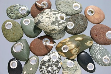
I must admit that we have a fond place in our hearts for the rocks and pebbles that litter the shore lines of the Olympic Peninsula. There is an outdoor work table in the side yard that seems to stay covered with the bounty of our last trip to the beach.

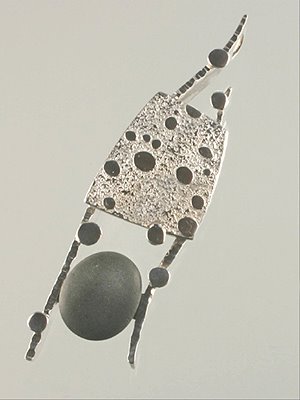
This is the beings of a new steel garden piece. As it was evolving I began to realize that it was just a big...really big... piece of jewelry. In any case, I have decided that it was okay. And so I have re-categorized it as a “tree pendent”. I plan on putting a chain on it in the next few days. But for now I wanted to post it here to document it's start. You see it here laid out on the floor so I can figure out just where the support posts go to hold the beach rocks in place. It still has all the spot welds and forging marks unfinished on it. If you look close you can see where the rocks are numbered with soap stone so I can put the darn thing back together later.

The moment that I realized that it was jewelry was when I went to the trouble of welding the insert...all the twists and spirals, into the frame using plug welds from the sides. This is a clever technique I picked up from working with James Wallace aka “Wally” at the National Ornamental Metals Museum in Memphis, TN. It makes for very clean, neat and very beefy connections which are easily hidden. It is off to the sand blasters for now. I am really looking forward to seeing the “Tree Pendent” completed and gracing the red maple just outside of the studio and smithy.

Thursday, March 4, 2010

Black n Tan


This was a piece made for a show called “Small Works Show” which was sponsored by the Blue Whole gallery here in Sequim, Washington. There has been considerable attention in the local art scene focused on the environment. “Black n Tan” uses a background of “re-purposed” corrugated cardboard. I glued up sections of the material and then cut that into strips, cut those into cubes and glued up the entire sheet. The pink material is copper and the silver color is aluminum. Ah... aluminum the “non metal” metal; I have always avoided it like a bad in-law. But it was recycled as well so it seemed appropriate to use it here. I can not recommend that everyone stop what they are doing and try aluminum out. So far I have found it best used in beverage cans, ladders, small boats and street signs.


There is one element of this piece that can be removed and worn as a pendant. On a triple cord it comes off as a necktie look. The cord is stored in the back of the wall piece. As a post script it might be noted that this piece caused comment because it was hung as a diamond among a wall where everything else was at ninety degrees. I took it down. It's venue will be elsewhere.

the beach rocks

the beach rocks
Although I have been lucky enough to receive many accolades and awards during my professional career as a jewelry designer, I was nearly always fulfilling a commission and therefore the aesthetical concerns of my client. Now that I have relocated to the great NorthWest I am pursuing my own images for the first time since graduate school…and loving my craft with a renewed spirit.

deep currents

deep currents
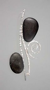
This was inspired by the way the river's currents swirl around the rocks that sit on the bed of the river.

in the kelp bed

in the kelp bed
At times I let my mind wander to what is happening below...in the depths of the kelp beds. I image how the cold waters waft and drift along. I like to think about the serenity of life in the kelp beds.

two six rings

two six rings
We called these rings "six ring" because when you see then from the side...in profile...they reminded us of the number six.